Amsterdam Exhibition
Showing work at the Plantage Etalage
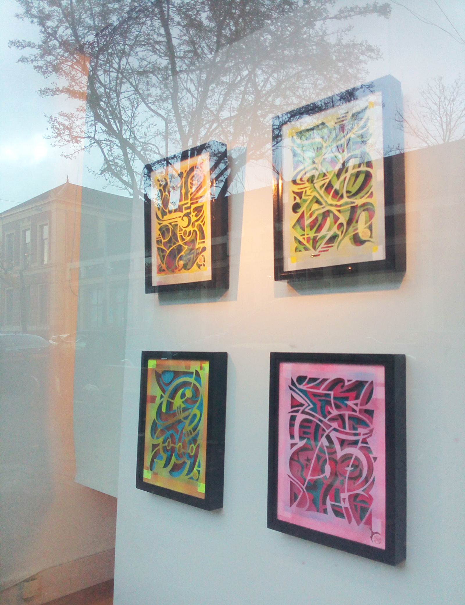
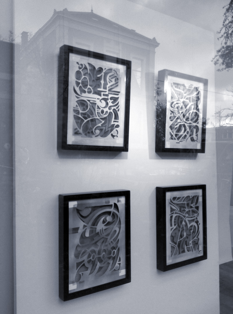
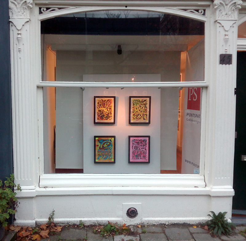
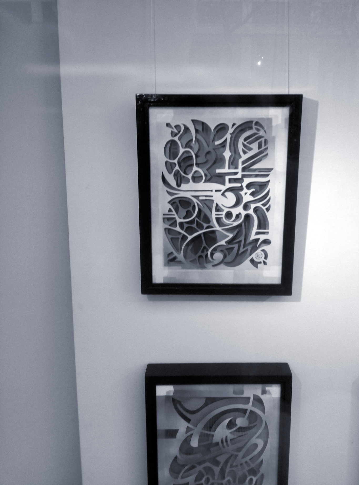
In the month of november 2020 I am showing four works from my Valutagrafie Series at Kjeld de Ruyter’s Plantage Etalage in the centre of Amsterdam, across from Artis Zoo. Make sure to take a look if you are in the neighbourhood this month!
Plantage Etalage
Plantage Kerklaan 45/bg
1018 CV Amsterdam
This one was designed before V 008 (check) but cut and painted after. Further adventures in using existing iconography and pictorial elements.
I cut the third layer for a second time, dark colours didn’t work that good with the second layer. Chose for blue instead; acrylic with a fine coat of white spray paint.
Further experiments combining spray paint and acrylics. For example, for the top layer I spray painted a blue rectangle. Pink acrylics over that, and light use of red spraypaint to finish it off.
all three layers: acrylic paint, spray paint
30 x 40 cm
I feel like I’m close to the edge here regarding complexity. After this one I might do a few steps back.
Once again I incorporated some existing shapes in this one. Parts of a logo of a Dutch warehouse chain that doesn’t exist anymore form the basis of a 2, some characters from the logo of a photography brand combine to form a 3. There’s a revolver in there too.
Quite a few layers of paint here: 4 coats of acrylic and 13 coats of spray paint.
This one felt like a breakthrough on a couple of fronts. It’s the second one where I added figurative elements but the first one I was satisfied with. There’s a Mondriaan painting and also a prehistoric cave drawing I interpolated. The $ sign is based on the Superman logo.
The trickiest thing is to get the three (or four, really) layers to interact with another in a satisfying manner.
This is also the first work where I added extra color after cutting the layers. I added spray paint to the front and middle layers. When I spray paint I often tape the paper to a cardboard rectangle. Here I decided not to hide the tape but to use it as an extra element in the composition. I particularly like the spots where the tape is removed and the little yellow rectangles appear.
After making this one I had the simple realisation that you can bring almost everything back to shapes. So integrating elements from all different times and cultures felt natural to me.
With this one the ideas came quickly. This is the first work where I succesfully added an extra layer in the background. I experimented with using stencils and spray paint. The best effect was achieved by cutting out part of the back layer. The fuzzy edges of the stencil didn’t quite work with the stark lines of the cut out layers.
I added cents to the amount on the painting, to give it some extra detail. The 44 may look like a font but I designed it myself.
This is also the first time I added extra color to the front layer, yellow in this case. It took some time to get the different colours in a right balance but I think I found a way.
There are some things you realise when you start making actual things after years of creating work that mostly exists in the digital ream.
First off, there’s no undo button. For example, when cutting a layer, one mistake means starting all over.
Years ago I started painting again, for a while. I had finished a painting but wanted to change the colours. Of course that would mean I had to start the whole thing over again. The possibilities the computer gives you, to endlessly tweak and chance things, felt hard to give up on.
In my Valutagrafie technique I’m ending up somewhere in the middle. If I screw up cutting a layer the design is still there. If I want to repaint a layer because the colours don’t work in the context of the other ones the design is still there (repainting a layer that is already cut out isn’t always an option). I may have to print and paint a new layer but I’m not totally starting from scratch.
Then I had to find out the right way to paint the frames that were made for me. Also: figuring out the optimum distance between the layers, what glass, wood and paper to use and the best way of mounting them. All quite adventurous when you mostly make digital content.
Still, it’s very rewarding when you finally have an object with weight, depth and smell (wood and paint, mostly).
Nine Hundred Eighty-Five Euros started as a version of Eight Hundred Sixty-Five Euros (in progress). Although I didn’t like the combination of layers there, I did like the upper layer. So I decided to keep that one and start designing a new sum under it, one that follows the shapes of the upper layer.
To me, an interaction between these layers is a bit different from my other works.
Although I didn’t use any recognisable shapes in this one, they do seem to emerge nevertheless. In my next pieces I started exploring this further.
I used a bright red on the backside of the first layer that reflects on the yellow underneath.
If you have this piece of glass, and your idea is, let me put this away while I work on something else for a minute, don’t, I repeat don’t put it on your swivel chair. You will forget it and hear a strange sound coming from behind your back whenever you decide to sit down. If you have excellent reflexes, like me, the damage is manageable. But if you don’t, you might end up having to call a doctor with a flesh wound caused by sitting on a piece of glass you put in your chair yourself. Beware!
all three layers: acrylic paint, spray paint
30 x 40 mm
What you see here is the second version of this design. The first one was made on inferior paper. I took up the chance to update the design slightly too.
I worked on this between two more intricate designs. It was interesting to work on something more straightforward. I intend to dial the complexity back again after finishing my upcoming works.
Layering the colours quite extremely here too; the upper one went: acrylic (two layers, two colours), spray paint (two layers, two colours) and a final coat of acrylic. The last three layers applied when the layer was already cut.
Not every design makes it to the finish line.
Still, I found out some things working on this one that I could use later on.
An idea here was to repeat the inner shapes of the 8 and the three. Visually, a little sub par. Also, the layers don’t interact with another in a satisfying manner.
Might re-use that 4 sometime, however.
This work is the first one of the Valutagrafie Series that I was truly satisfied with. Also one I got back to after a while, looking carefully why this one works better than some of my designs that followed it.
It is based on an earlier version I made at 21 x 29,7 cm size. Pretty soon I decided the work had to be a little bigger than that, leaving more room for details and giving it a less ‘boxed-in’ feel.
This one didn’t make the cut. I don’t think it’s really bad. But it’s not really good either, and it should be.
I found out some new things designing this one, however. Especially the use of paint on the back of the first layer so that it reflects its color on the layer below. Also a further retreat from using the front layers as just outlines for the numbers and the start of a more loose approach to the implied passe-partout.
I like the way the € sign and the numbers all interlock and there are shapes in the front layer that are dope too so I might make an update, salvaging some elements from this composition.
The idea of self sampling is something that has appealed to me since the days of the It Takes a Nation of Millions to Hold Us Back album by Public Enemy (“Bass! How low can you go?”).
I will collect here some of the work I made that lead up to the Valutagrafie project.
Expect: Spam Comments series, Svea series, autonomous typography
Some merit in this design but eventually it didn’t feel up to my standards. The large amount of horizontal lines makes the work a bit too stiff to my tastes. This is also where I found out that the paper I used was too thin.
I might re-use one of the numbers in a later work, that five isn’t too bad.
A variation on this design was the basis for the upper layer of Nine Hundred Eighty-Five Euros.
my thanks go out to
Wim Wepster, for building the site
Bert Nielsen, for building the frames of the artworks and priceless technical knowledge and feedback
Machiel Botman, for planting a seed


 the subject of the art is the price of the work